“If your donation form is straightforward and user-friendly, your donors will likely have a great giving experience.”
Online donation forms or pages are fundamentally important to any nonprofit or association. Hence, putting in those extra efforts to make the form readable is justified. Not everyone who visits your donor page has a desire to go through your elaborated illustration of guidelines, usage metrics or your latest research. We at Aplusify thought of being that nerdy visitor and explain to you in detail, what actually is required on a donor page.
Keep Your Users Hooked

It might look effortless but when left overlooked, it can become tempting yet distracting. When a visitor enters your website’s landing page, the last thing you will want him to do is, let him go for other opportunities elsewhere. Having to present the visitors with your interactive content assets such as twitter feed, latest posts from your blog and social media handles before signing up the form, will take the ball out of your court. Use your assets to engage the visitors and bring them to the point where they end up signing in.
Follow the Single Column Policy
Multi-column layout design of your donation form can distract your users, especially when they are viewing it on the web. What if the form is lengthy? Users are actually used to scrolling down the page rather than fumbling for information on the same cluttered page. Earlier when the web was young and users weren’t so trained about internet habit, then this was an issue. Apparently, we have redefined the standards of interaction. If you are expecting the users to scroll down your form and be comfortable with it, it is absolutely fine.
Is your Donor Form Mobile Friendly?

Don’t have a responsive form that can fully be optimized to support the view on a 5-inch screen? No issues! But at least keep your screen legible for those who prefer mobile browsing. Avoid using flash or other magical non-standard widgets that might not support mobile interface. Your donor form should refrain from the use of sliders, custom coded or dropdown widgets, etc. Last but not least, don’t believe in the ‘hover over menu’ for the display dropdown. Many a time it doesn’t work, hindering your users to move forward. Eventually, they end up closing the tab.
Shorter is better

The longer your form is, the greater is the chance of its abandonment. And that’s exactly why it is always suggested to keep your donor form short, crisp and precise. When a visitor lands on your donor form, seeing a ton of information on the screen will not delight him no matter what. Overwhelmed with the situation and thanks to your overdose of information, this extra loaded user will simply leave the screen. This reaction is multiplied when you ask further questions that he isn’t prepared to answer; that calls for short and sweet words on your donor form.
How to fix lengthy donor form?

Tips to fix the lengthy donor forms
Here’s a couple of things that can be done:
• There are various things on the form that sticks unnecessarily. You can collapse and hide things like honor and memorial field to make your landing page faster and length of the form shorter.
• Make your donor form easy to fill, especially when asking for extra information.
For example, allow your users to copy the mailing information to the billing information if they both are the same.
• Work upon your pre-populate forms to take less time of your donors.
What is your Payment Processor Preference?
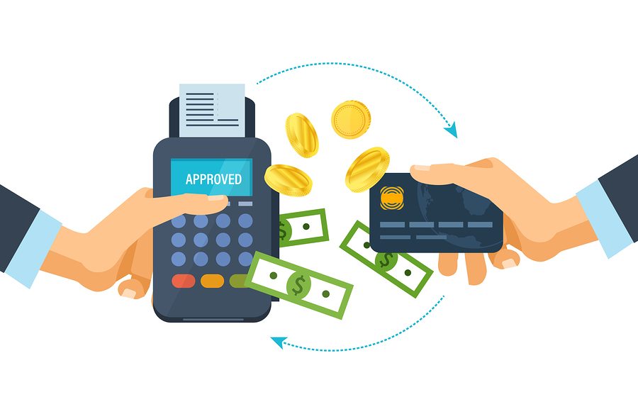
Online donation form uses payment processors to take the currency from the donor’s account and transfer it into yours. Each payment processors have their own advantages and disadvantages. Choose the one that best fits your needs. Moreover when it comes to choosing the processor, carefully weigh your options and give a thought to the donor experience
Post Redirect URL
After your donor is done with the form submission, they encounter a message screen. Instead of showing them a generic message screen that has nothing more than a thank you note, redirect them to your websites home page or to the customized landing page.
Are you ready to revamp your Donor form? It’s time for a positive change.
Do you want some more engaging content? Stay tuned for our next blog on Aplusify, your perfect Salesforce® Partner.